CV Layout Examples & Design Tips to Get You Hired This Year

Writing a curriculum vitae (CV) can be a daunting task, particularly if you have never done it before. However, the way in which you present your work experience and history, including job description details, is often just as important as the details themselves, especially when prospective employers have to comb through piles of resumes just to fill one position. If this is the case, having an eye-catching CV layout can mean the difference between getting that second interview for your dream job and getting lost in the shuffle.
While you don’t want to go too crazy and turn your resume into a flyer for a kid's birthday party, thoughtful use of font, colour scheme, spacing, color and graphic elements can give your CV that little extra something that sets it apart from the rest of the bunch.
Recommended links:
- Our collection of 500+ professional resume examples.
- Our gallery of 20+ downloadable resume templates.
A good CV writing strategy is to decide on the basic CV layout you are going to use before beginning to create on the details of the resume content.
Consider your skills and experience, the country you are in (such as the UK), the company, and the position you are applying to. Use this information to choose the best sections to include on your CV, the order in which you arrange them, the relevant experience to prioritize, and the right CV template. The right free CV template would should offer flexibility for different countries and job types.
What sections should I include in my CV layout?
Mandatory CV Sections
There are three CV sections that are absolutely necessary: contact information, relevant experience, and education, with enough space allocated to each. Without these elements, your CV will be incomplete. Your contact information is necessary for any interested party to contact you, such as marital status where required, recruiters or employers. Your Work History section is required to showcase your professional experience and achievements. Your education section is needed to highlight your educational background and scholastic achievements in a professional CV. These three sections together make a complete, if minimal, standard CV.
Contact Information
- Begin with your name in the CV header, contact details for easy communication, and additional sections as needed. Following that, include your phone number, email address, and home address or city. Make it as simple as possible for potential employers to contact you.
- Many countries outside of North America require more personal details than the basic contact information, such as age, marital status, gender, and nationality. If you are applying for a position where this information is required, include it in this section. For more information on when to include additional personal details, you can check out our article on what to include in CV guide.
- If you like, you can also include social media links on your resume. Links to a personal website, online portfolio, or LinkedIn profile can also be a great asset to your CV. This is particularly true of jobs that require tech or social media know-how, such as marketing or design. Before including social media in your resume, however, make sure it is work appropriate - no Instagram feeds full of party photos or Twitter feeds where you go on angry rants!
Work Experience
- Your work experience will make up the bulk of your CV, so using a CV builder might simplify structuring it. And, include bullet points for easy reading. There are a few ways of organizing your work experience (either reverse-chronological, functional, or a combination of both - this will be discussed later in this article). Remember, your work experience should be customized for each job application and include bullet points to focus on your achievements. For some resume writing tips, you may want to read the VisualCV resume guide.
Education
Even if you're not writing an academic CV, you will still need to have an education section on your curriculum vitae. However, the emphasis you place on it depends on your experience level and industry. If you are applying for jobs that have specific educational requirements, then it is wise to emphasize this section. If not, then it is fine to leave it as relatively sparse, noting only your certifications or degrees earned and the relevant dates. In most circumstances, the education section will be “placed at or near the end of the resume”, according to resume professional Susan Ireland. However, if you are a recent graduate and your educational achievements are more impressive than your work experience, you may want to place this section above your work history when considering your CV layout. Only include your high school if you do not have post-secondary to note.
Recommended CV Sections
Some sections, while not absolutely necessary, can be a significant asset for your CV and are highly recommended. These additional sections add more depth to your CV when packaged together with the mandatory sections, and can be a great way to showcase your experience outside of the regular work experience/education format, such as a personal statement. These sections include your Summary and Skills sections.
Note that it is important to clearly separate your sections with a bold heading so it can be easily scanned by potential employers, catching the recruiter's attention.
A Professional Summary
- The Summary section typically appears at the top of your CV and quickly describes you and your capabilities. It is a great way to highlight your most impressive experience and achievements right at the top. By including a CV summary section, you ensure that the potential employer isn’t left wondering why you are the best candidate, having to parse through your work experience and education - you tell them right at the outset.
Relevant Skills
- A Skills section is a great way for you to offer a skimmable list skills format of your capabilities, using white space to enhance readability and highly the skils that you bring to each position. With a simple skills list, employers can see your highlights quickly and easily. The mark of a great CV is its ability to sell you as a candidate while taking as little of the recruiter's time as possible, and using clear headings can help - a skills section is an excellent way to do this. If you want to hone your CV and writing resume writing, specifically for skills sections, check out our in-depth guide to CV skills.
Optional CV Sections
You are not limited to the above sections, of course - it is your resume, and you can add any section, like a personal statement, that you know will help you get the job. Get to know the company and position you are applying to and decide how you want to present yourself so that you know which sections will make you look the best and impress the potential employer. Here are some examples of optional CV sections that may be an asset to your CV.
Volunteer Experience
- Occasionally lumped in with Work Experience, highlighting your volunteer experience can show that you are well rounded and dedicated to the causes that are important to you. This can also show that you are a go-getter who is willing to put time and energy into gaining experience and growing your network.
Your Portfolio
- If you are applying for a creative position, a portfolio of your past work, paired with a creative CV layout, is important to include in your CV. Freelancers should also provide a portfolio of past projects. Writing samples, images, videos, links to web projects - these are all important ways to show what you can do.
Relevant Hobbies
- Of all the sections, the hobbies section is the least necessary (indeed, many experts advise against them entirely). However, there can be cases where you can include them if desired. If your hobbies are particularly relevant, for example, you may want to include them. Perhaps you like to organize meetups in your industry or write an industry blog for fun - relevant hobbies like this can help you. Don’t include any run-of-the-mill interests like sports or movies, however - this is both boring and irrelevant, and will likely be seen as filler rather than valuable content.
How should my work experience be organized?
Your work experience constitutes some of the most important information your CV will present to hiring managers and potential employers. With that in mind, there are some things you should consider when organizing this part of your CV layout, using white space strategically. Do some research to see what the industry standard is for your profession. However, these are the most common formats that professionals use.
The Reverse-Chronological CV
The most common method of displaying your experience is in reverse-chronological order. Begin with your most recent position at the top of the resume, then work your way backward, describing your responsibilities and achievements in each position. This is the clearest way to showcase your career journey, as it allows potential employers to easily navigate your role and experiences in each position.
This format will work well for job seekers who have been in the same industry or field for a number of years and plan to stay there, for professionals whose current or most recent position is related to a desired position. Essentially, if your work history has no irregularities or major gaps in time employed, this is the best CV format for you.
The Functional CV
Another option is what is called a functional CV. Instead of ordering your experience in terms of time, order it in terms of skill set - that is, group related positions and experience together rather than listing them in order. This way, the focus will be on the skills and achievements related to the job you are applying to, rather than on career trajectory and the positions you have held.
The Functional layout method is not recommended for most job-seekers. Essentially, you should only write a functional CV if there are irregularities in your career history such as large gaps, frequent job-hopping, or significant industry changes. Recent graduates may also want to use this format if their work history is lacking substance. Even then, be careful, warns Jörgen Sundberg of Undercover Recruiter - “employers are known to raise their eyebrows when they see a functional resume so only use this format if you absolutely have to.”
The Combination CV
As described by Kim Isaacs at Monster, the combination resume “incorporates the best of the chronological and functional formats”. “It leads,” she says, “with a description of functional skills and related qualifications, followed by a reverse-chronological employment history.” By emphasizing related skills, this format allows a job seeker to highlight their capabilities rather than their career path.
Combination CVs may work for a variety of job seekers - essentially, anyone who wants to feature their skills over their work history. This might include recent graduates, specialists with a specific and important skill set, or experienced professionals looking to enter a new industry. According to The Undercover Recruiter, a combination CV is most useful “when someone wants to pack more skills in that the work experience section allows for or would not bring out adequately.” If this sounds like you, a combination CV is worth a try!
How long should my CV be?
One page is the standard CV length. There are exceptions, of course - if you “(1) are searching for an internship; (2) just graduated school; or (3) are relatively new to the workforce”, then you should try to keep your resume to one page, according to TopResume. On the other end of the spectrum are job seekers with decades of experience: “executives or senior-level managers” with “a long list of accomplishments and experiences”, or “people in the sciences or in academia who want to include their licenses, patents, or publications” can allow their resumes to grow to three or more pages if necessary, according to Alison Doyle at The Balance.
For most job seekers, however, with five to fifteen years of related experience, two pages should be enough to showcase your major skills and accomplishments. Indeed, there is some value in keeping your resume brief - “Short and concise means that employers are more likely to read the parts you most care about” says Alison Green of Ask a Manager. Keep it short to be sure that recruiters are seeing the best information as fast as possible.
Please note that the above information pertains mainly to North American resumes - to learn more about resume length in countries around the world, visit our international CV guide.
Choose the best CV designs based on your industry and potential employer
When choosing a CV design, research your chosen industry and the company you are applying to. It is important that the design you select meets the expectations of your field and potential employer.
For example, if you are applying to a large established company in a more conservative industry, a classic, professional CV layout will likely serve you best.
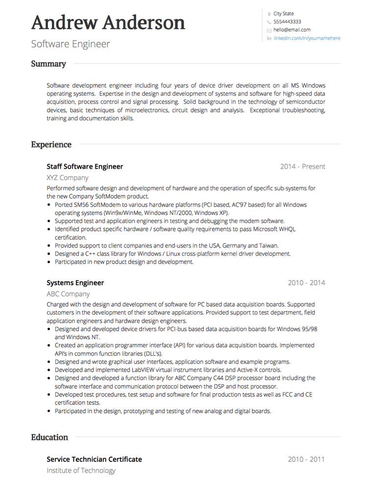
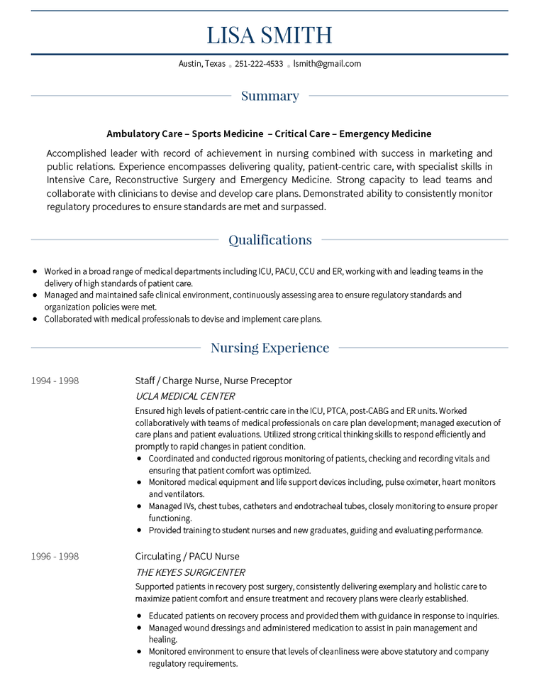
For the best CV examples, take a look at our professional CV templates, such as the Standard and Monte CV templates. These two designs feature good examples of simple but effective CV templates:
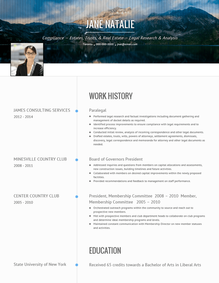
In a creative or more modern industry, a clean CV layout will likely work best. This is especially true if your job search focuses on companies in the arts or technology sectors. For these types of organizations, opt for modern CV templates with some colour, the addition of images, and more creative designs. VisualCV's Onyx(a modern CV layout), for example, features a large banner image to catch the eye:
The Modern and Vida templates, meanwhile, allow for a splash of colour and look great with a built-in Portfolio:
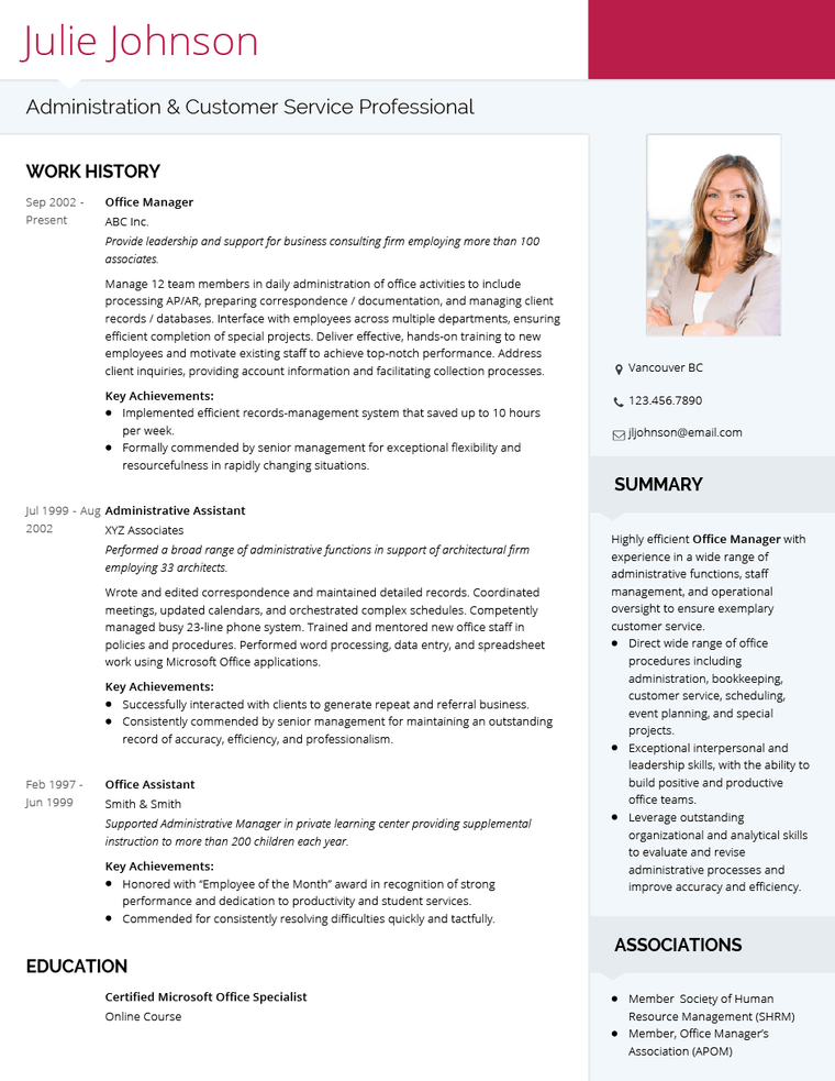
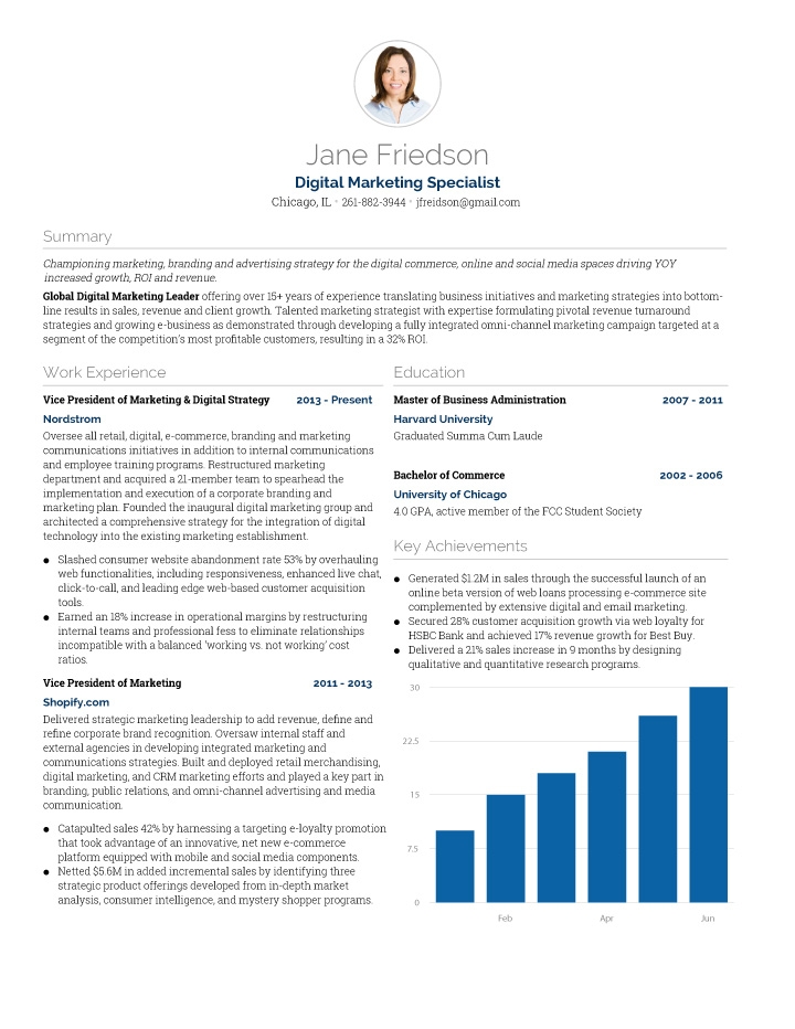
It is also important to consider the content and sections of your curriculum vitae - If you have included several shorter sections, a resume with more than one column can help you to save space. If you are sticking with the standard Work History and Education, however, a single column will be sufficient.
Choosing the Best CV Template and Cover Letter
Selecting the best CV template ensures your application is visually appealing and suited to the industry. Additionally, a strong CV cover letter can enhance your application by providing a personalized introduction and explaining your fit for the role.
What is a good CV layout?
A good CV layout is the one that helps you highlight the most important information in your CV effortlessly, is visually appealing and easy to read.
Make it your own with VisualCV
Whether you’re crafting your resume from scratch or using a CV template, it is important to put your unique stamp on it. Browse through some professional CV templates to find ideas you can implement right now, or pick a template that is easily customizable. Your CV should be legible, eye-catching and unique. Even if it’s something as simple as adding a dash of color, your CV should convey who you are as an individual—but try to keep it understated, your qualifications should always be the star of the show.
Remember: your CV is an extension of yourself, and can be the key to making a good first impression.
You wouldn’t show up to a job interview in shorts and a paint-splattered t-shirt, so you shouldn’t settle for a boring or messy resume. You want a CV that represents you in every way, from your qualifications to your professional attitude and appearance, and a carefully designed CV layout will do just that.

Written By
Ben Temple
Community Success Manager & CV Writing Expert
Ben is a writer, customer success manager and CV writing expert with over 5 years of experience helping job-seekers create their best careers. He believes in the importance of a great resume summary and the power of coffee.

Figuring out how to design a resume isn't easy. Here are 10 great resume examples to inspire you.
April 9, 2015
Read Post

Co-Founder & Director

For every open position there is a perfect resume, but no resume is perfect for every open position. Every job you apply to needs its own customized resume that is tailored for that specific job title and description. In this guide, we will outline the steps to customizing your resume for every application.
September 4, 2020
Read Post

Community Success Manager & CV Writing Expert

Your resume font says something about you. Make sure your resume is stylish and professional with the right font.
May 20, 2022
Read Post

VP Marketing & Resume Expert
Copyright ©2025 Workstory Inc.